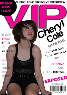
Monday, 10 May 2010

Pictures For Magazine

Rough Cut Pictures:


Front Page:


Contents Page:


Double Page Spread:
Final Magazine Pictures!


Front Page:
Contents Page:


Double Page Spread:


Monday, 26 April 2010

Final Draft Of Music Magazines:


Front Cover:

Contents Page:

Double Page Spread:


Tuesday, 20 April 2010

Feedback for Rough Cuts!

Feedback for rough cuts for my Front Cover:

Teacher feedback:

Photoshop- Rough around the edges use the eraser tools.
VIP needs retyping.
Use more images and compare to style model for layout.


Feedback for rough cuts for my Contents Page:

Teacher feedback:

Needs more structure.
Check style model.
Add in more images.

Feedback for rough cuts for my Double Page Spread:

Teacher feedback:

Use three columns for text.
Use quote to break up text.
Write up introducing paragraph.


Pupil feedback for improvements:


Front cover could have a background.
More colour.
Could put page numbers in a different colour to make them stand out bit more.
Spend more time on images; maybe change the font of text.
Use more than one person for pictures.

Teacher and Pupil Feedback on what they like about my magazine:

Front cover and double page spread is good.
Good ideas and layouts.
Layout ideas are really good.
Images are well thought out; double page spread is well laid out.
Photos are useful and relevant.
Good layout on double page spread.
Beginning of a good brand and colour scheme throughout magazine.
Page numbers, magazine name and issue data on each page is good.

Diary Entire Ten!

This week I am adding in the finishing touches of my magazine in order to make sure that it is finished for the deadline at the end of the week, which Monday 26th April. I am also asking my friends for feedback on my work to make sure that it looks okay, and everything fits and looks write.

Diary Entire Nine!

Over the past two weeks, I have been using my teacher and pupil feedback to redesign certain parts of my magazine, using the feedback to changed and add in little bits of advice I have been given. From this i have took some new pictures of my friend for my magazine , I have also took more time when cutting out my images taking my time in order to make sure I am not cutting out parts of her hair or leaving the background in.

Diary Entire Eight!

This week is the final week for the rough cuts of my magazine, even though I know I have still got a lot of week to do this week like adding re cutting out my pictures as it is not perfect with rough edges, I am just trying to get my work to a standard in which I can had in. Tuesday was our deadlines for our work, I manage to get my work in save and copying my work in to the shared area saving it in a PDF so that it could be opened by the teachers. On Thursday in our lesson we got feedback for our rough cuts, as we had to go round the class room and comment on each other’s work to tell each other what we liked about each other’s work and what we think each other should improve.

Diary Entire Seven!

This week I am going to start my music magazine rough cut for the deadlines which is the Tuesday 20th March. As I had an idea on what I was going to do my music magazine on and the theme in which I wanted it to be basic on, I decide to write my article for my double page spread this was because I did not have any of my pictures taken yet. I decide to do this in order to save time by not wasting it doing nothing. I manage to finish my article half way through the lesson to day which gave me time to mess about placing my article on my page along with my title and quote in order to see what would go and what would not. During the rest of the week i hope to have all the text for both my contents page and also my front cover so that as soon as i take my pictures i can rearrange and place them on.

Tuesday, 23 March 2010

Picture Table

Here is a table of four of the pictures and details about them that i am going to use on my magazine.


Thursday, 11 March 2010

Feedback On Questionnaires:

Feedback On Questionnaires:


Hand Draw Sketches of Contents Page, Double Page Spread and Contents Page


Hand Draw Front Page Sketch :


Hand Draw Double Page Spread Sketch :

Hand Draw Contents Page Sketch :


Thursday, 4 March 2010

Graphs For Target Audience Research:


Graphs For Target Audience Research:

Underneath are all my results from my questionnaires put into graphs.


1.When handing out my questionnaires I decided to choose a even number of both males and females in order to see what differences there are between the two genders.

2. From my research I found out that only 4 participants out of my 15 brought music magazines. 3.I found out that there are a number of different things which make people buy a magazines, one of the most popular answers was free prizes which are given away with the magazines. This could be some thing I used with my magazine to help draw my target audience attention to my magazine.

4.After looking at the results for question two I did not think that many of my participants would know many names of music magazines, however I was quite shocked to find that although they do not read them, they are aware of their names. Kerrang and NME are to of the most popular music magazines which my participants named.
5.The majority of my participants said they would spend up between £2.-00-£299 on music magazine this gives me some guidelines on how much money I should charge for my magazine as I do not want to sell it to cheap or to high.

6.Before I did my target audience research I was thinking about doing a pop music magazine however now after doing my research I have found that no many people read pop magazines and maybe this would not be such a good idea, as I would not catch as my readers.

7. From my research I have found out that some of the main things which draw my participants to the magazines are the images and the bands featured in the magazine. From this I now need to make sure that any pictures and the band or artist I use for my magazine are eye catching and effective in order to catch the reader’s attention.

8.Out of all the answer I received for this question the majority of my participants answered the same answer saying that they like interesting music magazines.

9.My participants have said that they like lots of pictures rather than lots of information from this I am going to try to include lots of pictures but also make sure I have another information.

10.For this question I received a even number of answers for both just a few and lots of features, from this I have decide to go in between on the amount of features I place on to my front cover in order for me meet both sets of answers.

11.This question did not really help me that much as I did not get any artist or bands coming up twice which would help me to choose which artist or band I could use for my magazine. How it did give me some examples of bands and artist which my target audience like at the minute.


12.Before my target research I had decided I wanted to place a picture of my bands or artists, after looking at all my results my target audience has reassured me to do this as this answer was given on a number of occasion.


13.When deciding my magazine I will need to be careful that I do not include to much information or price my music magazine high as these are two of the answers in which my participants say that put them of music magazines.


14.After looking at this question I am going to think about maybe putting some thing in that may be free for each song lyrics as my participants have told me that this helps them to choice one magazine over another.


15. From my results for this question it has helped to think about what my double page spread article is going to be about. From this my participants said they expect interviews, artist and band information and pictures. So for my double page spread my article is going to be a interview with an artist or band giving the reader lots of information with a whole load of pictures for them to look at.

Target Audience Feedback From Questionnaires:

Target Audience Feedback From Questionnaires:

Underneath is a number of completed questionnaire in which my target audience have filled in and completed for me. From my questionnaires I receive a lot of information and a range of answers all in which were very interesting and important.


Diary Entire Six:

Diary Entire Six:

For homework I complete my picture table in which I then scanned into the computer and then uploaded it to my blog. At the being of the week in class we looked at a number of music magazine articles and how they are written. We looked at an article about Lilly Allen, using highlighters we looked at the different types of technical terms which are used throughout the articles like things like; Taboo Terms, Personal Pronouns, Formal and informal information and the different types of puncation which is used throughout. As a result of looking at this article in detail it really helped me to understand and analyse the article a lot better allowing me to notice things in which I would not of picked up on if I had of just read it out in my head. This week we also picked a magazine article our self and we had to analyse and looked at the article and write out who we through the target audience, gender and age, what interest the person might have who would read the magazine and their occupation. I found this part of the task pretty easy to do however I struggled a little bit on the second part of the task which was to look at the article in more detail and pick out the different technical terms used within.
For home work this week I had to hand draw three design for my music magazine on paper, one for the front cover, double page spread and then for the contents page. I found this task really hard as I was still not sure what I wanted to put on my music magazine and what it was going to be about.

Diary Entire Five:

Diary Entire Five:

During this week I uploaded and post on my blog my homework which had been set the week before which was my initial plan which I decide to design by using a spider diagram as I had a lot of information to put in to it so by using a spider diagram it gave me more room.
Once I had done this I gave out a number questionnaire to a range of both males and females asking them to fill in some questions about music magazines and whether or not they buy them. These questions are all part of my target audience research, along with the questionnaires I then asked a number of my participants who completed my questionnaire to be in a video in which I took of them answering my questions from my questionnaires. Once I had all my completed questionnaires back in I then used Microsoft word and excel to create graphs in order to display my results so that I could evaluate my findings and see if there was any patterns throughout my answers.
When designing my questionnaire I tried to uses relevant questions which could be answer straight away giving me the answer that I wanted, so that I did not get loads of information in which I did not need or not enough information. I used a range of Qualitive and Quantitve questions throughout to give me a range of answers and to add some variety to my questionnaire.
Everything this week went quite well with everything going smoothly, the only slight problem was that I could not get one of the videos of the camera but after a while I manage to re connect the video camera and transfer the video.
This week for homework I had to design a table that I would be able upload on to my blog that would allow me to describe the details of every image I am going to put into my magazine and on which page I am going to put them on to. In this table I am going to have a column for what the picture is, time and date in which the image will be taken, what the picture is of who the model is and what costume they will be wearing. The location and mise-en scene of the image, the lighting, set up time and any camera angles and the distance between the camera and the image.

Wednesday, 24 February 2010

Target Audience Research Video 1!

Target Audience research Questionnaire:

Target Audience research Questionnaire:

1. What Gender Are you?

Female[ ]
Male[ ]

2. What types of magazine do you buy?


3. What makes you buy these magazines?


4. Can you name any music magazines?


5. How much would you pay for music magazines?

£1.00- £1.99 [ ] £2.00-£2.99 [ ] £3.00-£3.99 [ ] £4.00-£4.99[ ] £5.00 + [ ]
Other __________________________________

6. What genre of music magazine would you or do you read?

Hip Hop [ ] R&B [ ] Dance [ ] Indie [ ] Rock [ ] Pop [ ]
Other __________________________________

7. What draws your attention to these magazines?


8. What do you like to read about these magazines?


9. What do you prefer, lots of pictures or lots of information?

Lots of pictures [ ]
Lots of information[ ]

10. Do you like lots of features on magazine covers or just a few?


11. Who is your favourite artist or band?


12. Who would like to see on a cover of a music magazine?


13. What puts you of a music magazine?


14.If the magazine had song lyrics, posters or other free stuff in side would you go for that music magazine over another one.


15. What content do you expect from a music magazine;

Interviews, [ ]
Real life stories, [ ]
Artist and Band Information, [ ]
Pictures, [ ]

Initial Ideas Diagram !


This is my initial ideas spider diagram where I have noted down all the different things I feel are important to a making a good magazine. I have come up with these ideas from looking at my research, I have also noted down some ideas in which I am actually going to use with my magazine.


Alison Mosshart Double Page Spread:


This double page spread is set and styled all in black and white, including all of the shading, image and also the text and background colour. The columns of this double page spread are spilt up in to three clear sections. The picture which is the only image on this double page spread is a medium close up of a women looking quite serious. This picture helps to make the double page spread look interesting drawing in the readers attention in to what the article is about. The background of this spread is all white, this helps to make the text stand out as it is written all in black. This double page spread does not really follow the rule of three, as it has text going over each section. From looking at this double page spread i would say that the main target audience for this article would be middle age women.
Lives Double Page Spread:

“Lives” target audience is set instantly when looked at by this double page spread by its use of pictures. The different medium and close up shots of people playing the guitar, singing and been carried by the crowd shows the reader that this magazine is for male rock boys. Along the left hand side of the page is a white background which helps to bring the read back down in order to read the text after looking a the pictures. The text is written in one column set out in paragraphs along the left hand side of the page. At the bottom of the page is a little short question interview highlight in a black rectangle box which contains a picture.

Respect The Law Double Page Spread:

Respect The Law Double Page Spread:

This eye catching title of the this double page spread will catch any body’s eye and if that manage to make them pass then the image placed on the right hand side of the page will make them stop in their tracks. This eye popping picture sets the double page spread well, as it is big and bold and in different to other pictures. The medium close up of the women is set out on the right hand page slightly lapping over on to the left hand page, giving a sense of together ness rather than the pages been separated. There text written in black written is spilt up into three paragraphs each starting and ending a the same point. There are two quotes written on both pages the first cutting into the interview writing and the second next to the picture. The use of these quotes help to give the effect of the female in the people being the one to have said them. There are two different background colours to this picture one of which been a yellow and the other white, this helps to spilt up the text from the picture.

Steel Double Page Spread:

Steel Double Page Spread:

“Steel” is really throw out at the reader in this double page spread as the effective and layers of the pictures and the title makes it look as if one of the males in the pictures are throwing out his hand and giving it to the reader. This use of picture and position brings excitement and colour to the double page spread. With the use of the rule of three each person and text fits perfect in to a third section of the page. The text on this double page spread is spilt up in to two columns on either side of the pages with the image also the background picture popping out in between it. The chose of colours for the text is reflect and brought from the lighting and colours of the males colours. The red and white colour contrast each other in order to shown and present the text well. By using a grey colour for the “Steel” which is the band name and then “Zoltan Bathory” at the bottom it helps to make this information stand out to show that is the band name and this is who they are.