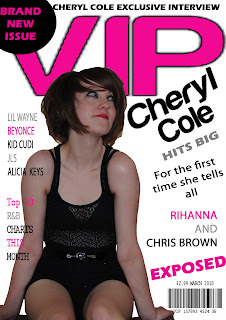
Feedback for rough cuts for my Front Cover:
Teacher feedback:
Photoshop- Rough around the edges use the eraser tools.
VIP needs retyping.
Use more images and compare to style model for layout.
VIP needs retyping.
Use more images and compare to style model for layout.
Feedback for rough cuts for my Contents Page:
Teacher feedback:
Needs more structure.
Check style model.
Add in more images.
Check style model.
Add in more images.

Feedback for rough cuts for my Double Page Spread:
Teacher feedback:
Use three columns for text.
Use quote to break up text.
Write up introducing paragraph.
Use quote to break up text.
Write up introducing paragraph.

Pupil feedback for improvements:
Front cover could have a background.
More colour.
Could put page numbers in a different colour to make them stand out bit more.
Spend more time on images; maybe change the font of text.
Use more than one person for pictures.
Teacher and Pupil Feedback on what they like about my magazine:
Front cover and double page spread is good.
Good ideas and layouts.
Layout ideas are really good.
Images are well thought out; double page spread is well laid out.
Photos are useful and relevant.
Good layout on double page spread.
Beginning of a good brand and colour scheme throughout magazine.
Page numbers, magazine name and issue data on each page is good.
No comments:
Post a Comment